Palettes of the Masters
- $99
- March 20, 2021
- 2PM - 3:30PM EST
Note: This series started on March 6th. You can still register and we'll send you recordings of the last session to catch up.
Live from Philadelphia, United States
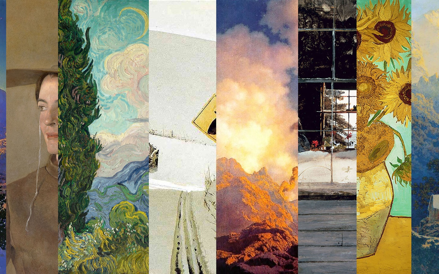
Join fine artist Clarissa for a 3 week series (or join individual sessions) to take a deep dive into the palettes of some of history's most influential artists – Maxfield Parrish, Andrew Wyeth and Vincent Van Gogh – and learn how to incorporate the palette in any material you work in.
Color has a vast language and complex system of symbolism, and has been used deliberately and thoughtfully by artists throughout history. By examining the work of artists who have come before us, we can learn to make informed choices about color - how it’s best used to convey a feeling, a tone, an atmosphere, a geographical location, or a narrative.
For 3 consecutive weeks, beginning Saturday March 6th, we'll meet each week for a lively slideshow, discussion and color exercise, about the palette of a specific artist. We’ll discuss the color relationships and symbolism, examples of that palette elsewhere (like in interior design, fashion, film, global culture…) and how to incorporate the palette in your work. Together we will develop an understanding of how color is a highly individualized language, reflecting the spirit of these artists, and how it fits into their respective art movements in history.
All levels are welcome. There will be plenty of time to share, get feedback and meet other participants from around the world.
Joining us from a different time zone? Be sure to convert the time.
March 6: Week 1 Maxfield Parrish - Illustration, Neo-Classicism

Palette to bring in - Prismatic, complementary - blue/orange, violet/yellow. Clear, bright color.
Maxfield Parrish, an American illustrator and painter who worked in the Neo-Classical style, was so known for his palette, that there’s a color named after him; 'Parrish' blue. It’s a cobalt blue that marks his vivid fantastical skies, mountains, and dreamy landscapes. His paintings often used a blue/orange or violet/yellow palette, both of which are complementary relationships.
We’ll look at his work (and method of working) and talk about how and where we see this kind of relationship and particular palette.
Palette: Prismatic, complementary
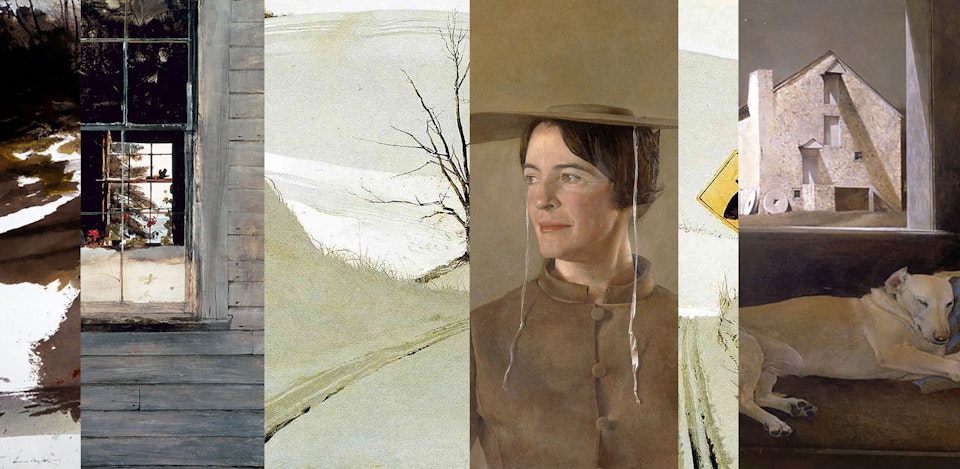
March 13: Week 2 Andrew Wyeth - American Realism, Regionalism
Palette to bring in - Earth palette - browns, greys, umbers, cream, white, yellow and red ochres. Neutrals
Andrew Wyeth was known for his regional view of rural America in a realist style. His paintings elevated scenes of everyday life. He painted around his home in Chadds Ford, Pennsylvania, and his palette reflected the colors and temperature of his surroundings - a cool, Northern light, frequently on snowy scenes that use very little color in his desaturated world. However, within the narrow palettes, we see the clarity of how color is relative and changed and reflected by its relationship to the whole palette.
Palette: Extended earth palette
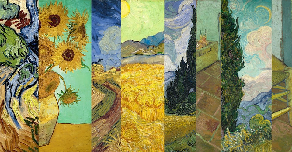
March 20: Week 3 Vincent Van Gogh - Post-Impressionism
Palette to bring in - Muted blues, golds, yellows, olives, earth reds, browns
One of the best-known artists in the world, Vincent van Gogh was a Dutch painter who created a prolific amount of work in a very short period of his life. He was considered a Post-Impressionist, his work marked by his signature expressive brushstrokes and bold, stylised scenes. His landscapes frequently depicted countryside with cypress trees, wheat fields and sunflowers, in blues, warms golds and yellows, soft greens, browns and earth reds.
Palette: Impressionist palette
What to bring
- For discussion, bring anything that reflects that week’s palette - artwork, photographs, something in nature, a textile.
- For exercise, bring whatever material you want to work in, that reflects that week’s palette. It can be paint, pastels, coloured pencils, photos or papers cut as 'pieces of paint’ etc.
How to join
We'll be hosting this VAWAA Online on Zoom. We'll send link and details to join via email 1 day and again 30 mins before it begins.
About Clarissa
Clarissa is a fine artist who studied at several of the oldest art schools in United States, while accruing over 40 credits in film and television as a scenic artist. Her paintings are largely inspired by cinematography, photography and other issues of filmmaking, which examines all the ways that elements of film pertain to painting - composition, visual cues, symbolic use of color, lighting/value.
Clarissa’s work embodies the same spirit of visual storytelling, and she loves nothing more than talking about film and pop culture and how it relates to art history.
Visit her artist page to learn more about her in-person VAWAA.
Reviews
"This is the kind of learning experience you never want to end. Clarissa is a knowledgable, experienced and inspiring teacher. You can't help but have fun while you're learning. I highly recommend her classes!" - Joyce
"Fascinating subject presented by a delightful and knowledgeable artist who clearly loves her subject." - Jennifer
"Thoroughly enjoyed. With Clarissa it is easy to stay present as one would not want to miss a word as she has much to share and does so in an easy, experienced, manner as she is passionate about her topic. Classes are readily accessible for all audiences to understand. Insightful. I applied my learnings to a self portrait I was working on. This is a class I would enjoy every week for a long while and an immersion would be great. HIGH MARKS!" - Lisa
"Clarissa is an excellent storyteller. I learned so much and really enjoyed the process." - Autumn
"Clarissa has a great way to deliver the material that highlights different context." - Fransisca
Sessions are ticketed to support artists, makers and our small team. If you’re experiencing financial hardship, please reach out. We may have a generous participant who has paid it forward and would ask that you pay the love forward by sharing online sessions with 3 new friends.